
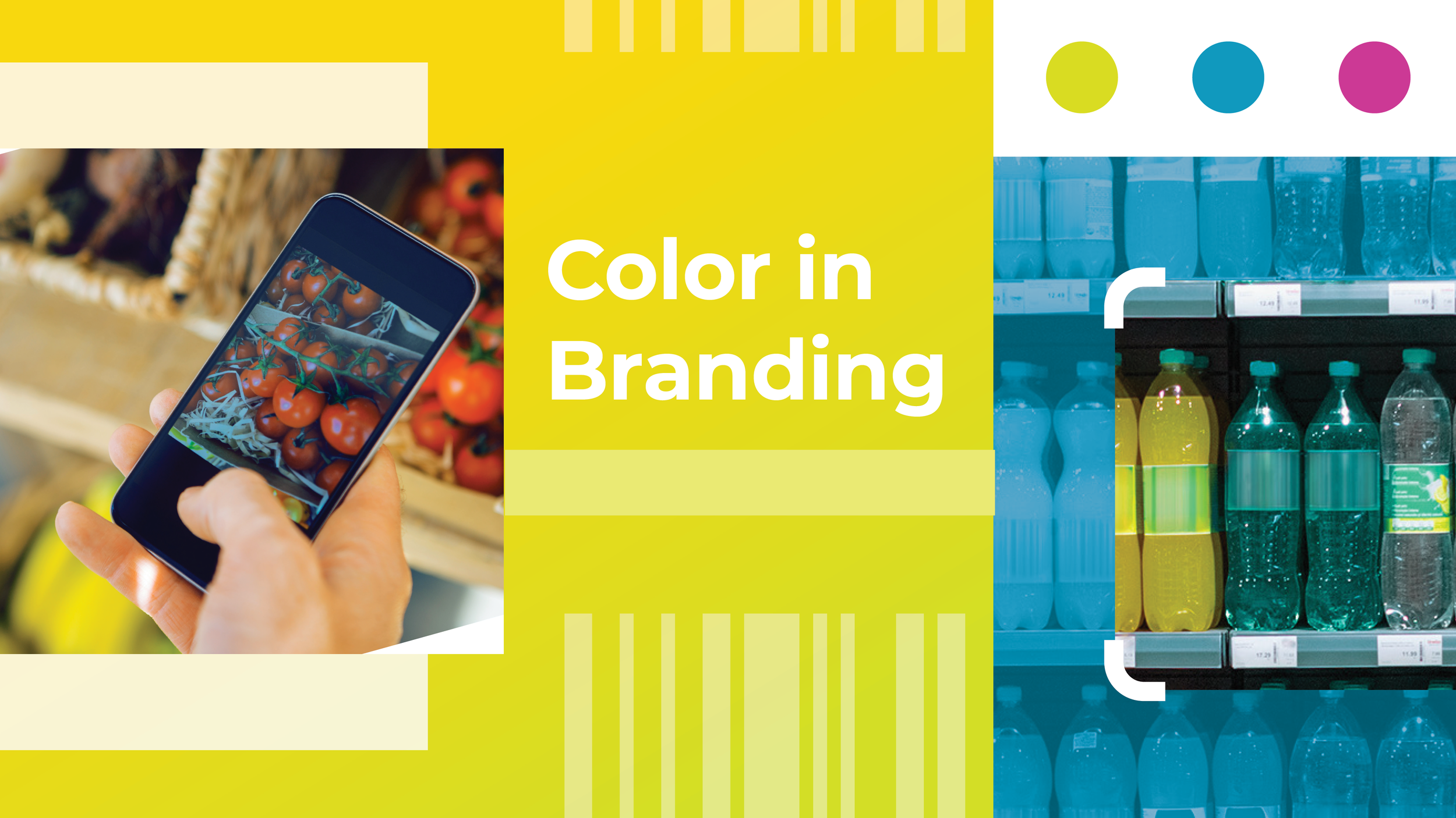
What Color Choice Says About Your Branding
Written By Lindsy Warnecke
Color is an impactful element of effective design. It heavily influences the “feel” and mood of a brand. Color also really influences consumer behavior (buying power), so thinking carefully about color choices is an important part of the design process.
For me, diving into color exploration for a brand sometimes feels a little bit like opening Microsoft Paint in the late 90s. So many options! Infinite possibilities! Where do I begin with this masterpiece?
Thankfully, there are some basics that can guide your choices about colors and use them to develop compelling branding. Let’s take a look at some basics of color theory in design that help visual designers make important decisions.
The Classic Color Wheel
The color wheel was designed in 1666 by Sir Isaac Newton to demonstrate how beams of light could be separated into color and then recombined into white light. Its purpose was originally to explain optics and discoveries in light but is now used more frequently to develop color palettes.
The color wheel is comprised of three primary colors (red, blue, yellow), three secondary colors which can be created by blending the primary colors (green, orange, purple) and six tertiary colors (colors created by blending secondary colors, like blue-green or red-violet).
If you split the color wheel in half, you can see half of the colors are considered warm (reds, oranges, yellows) and half of the colors can be considered cool (blues, greens, purples).


Decoding Color Choice
Color is an important mode of communication in design. It can evoke lots of feelings in consumers and ultimately influence behavior. While each color has no universally accepted meaning, here are some psychological associations with commonly used colors:
Red – action, strength, passion
Orange – optimism, enthusiasm, freedom
Yellow – warmth, clarity, curiosity
Green – growth, safety, health
Blue – trust, comfort, loyalty
Purple – imagination, mystery, creativity
Black – sophistication, formal, power
White – cleanliness, innocence, purity

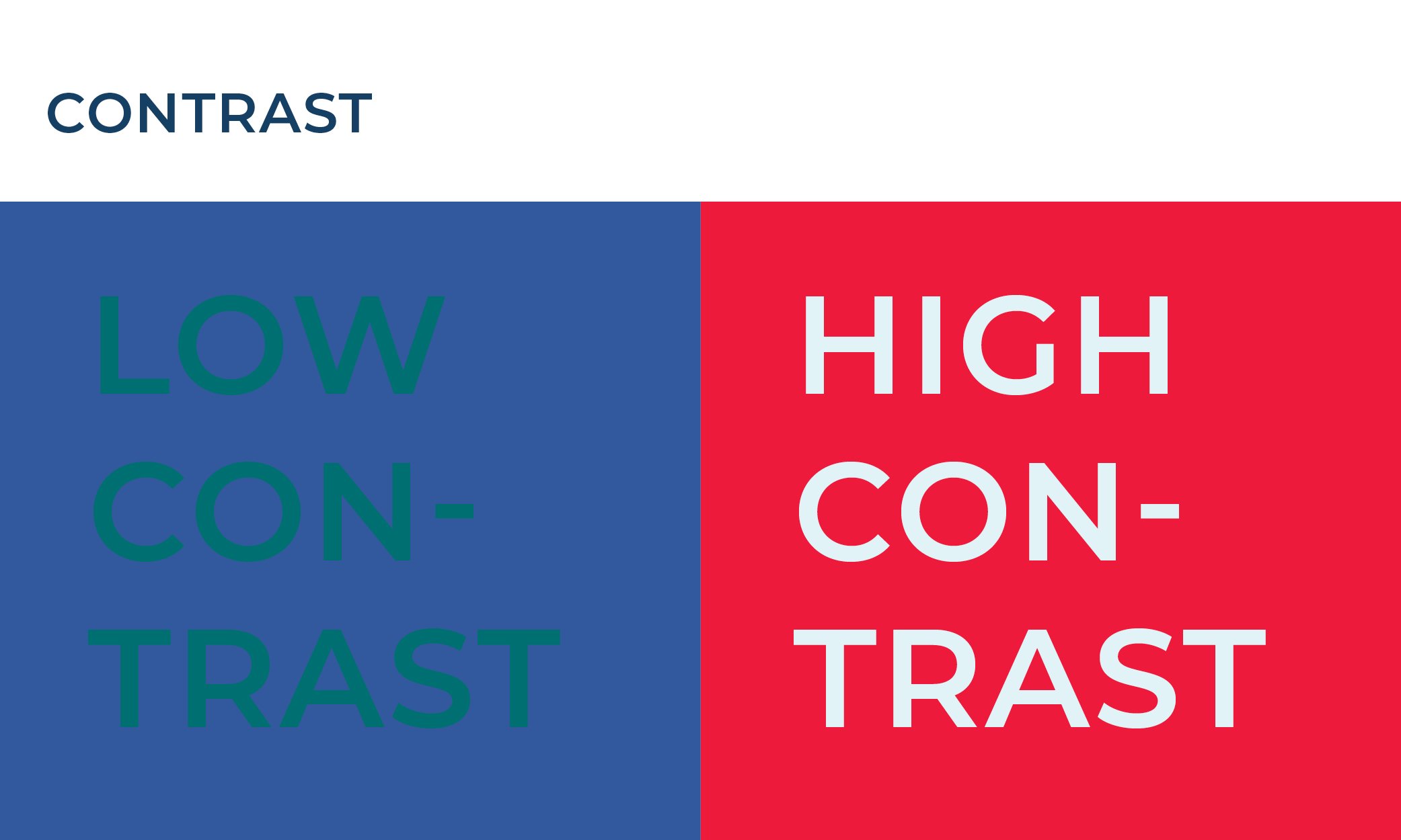
Other Considerations
It’s important for design to be accessible, so check that text copy and buttons are high contrast for legibility. A handy tool to double-check your work can be found here.
Caring About Color
“People decide whether or not they like a product in 90 seconds or less. 90% of that decision is based solely on color. So, a very important part of your branding must focus on color.”
With a little basic knowledge about colors and color palettes, you can now go out into the design world and make more calculated branding decisions that will ultimately result in success of your campaign.